Introduction
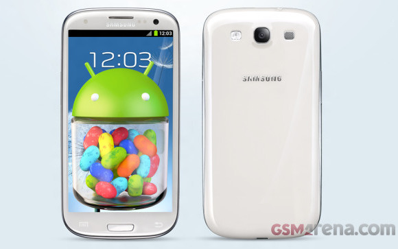
The Galaxy S III didn't stay in the R&D lab long enough to come with Jelly Bean out of box, but once the latest Android version was announced, Samsung was quick to commit to releasing a timely update. And it seems the wait will be shorter than expected with the official update coming in just a few weeks' time.
Knowing how great the Samsung flagship was on ICS, we just couldn't wait to find out how much better things got with Jelly Bean. It's not that the latest Android is such a revolutionary step forward, but it's a flagships duty to bring out the best of its platform and that just can't happen until it has the latest and greatest version powering it.
Our Galaxy S III has been tasting Jelly Bean ever since those first leaked ROMs appeared and now that we finally have some releases good enough to be your daily drivers, we thought we might give you a quick preview and show you what to expect after the official update hits.
With the official update rollout expected to start in just a couple of weeks, development is all about i-dotting and t-crossing so don't expect to see any major changes between what we have here and what Samsung will eventually deliver to your Galaxy S III.
We'll start with a quick rundown of the novelties that the Jelly Bean update brings to the Samsung Galaxy S III to get you up to speed.
Galaxy S III Jelly Bean update new features:
- Project Butter - smoother UI animations with higher frame rate
- Google Now
- Offline voice typing support
- Better notification area with expandable notifications
- Better Settings organization
- Two different modes for home screen behavior
- Resizable pop-up play window
- S Note app replaces S Memo
- Faster web browser
Sadly, the update will cost you your official Flash support, but at least for now you still get the option to side-load a modified Flash apk if it's a must-have for you.
We tried it and it worked fine, but even if you don't want to install software from outside the official repositories it still seems like a fair trade - as long as all the other new features work as expected, that is.
So let's waste no more time and find out - we'll start with the user interface right after the break.
User interface: Project Butter and some new TouchWiz goodies
The so called Project Butter, which raises the UI animations' frame rate to consistent 60 fps, is one of the key novelties of Jelly Bean. The Galaxy S III was always really snappy, but now its interface feels even more fluid.
The UI animations are great - opening and scrolling the app drawer, switching between home screens, opening and closing system apps - everything is a tad smoother and has a more natural feel to it.
Here is a demo video of the Jelly Bean powered Samsung Galaxy S III in action.
It's not that easy to spot the differences and we needed to handle two Galaxy S III units one after the other do so, but they are there. You might want to check out the official Google demo of Project Butter, to get a better idea of what we are talking about.
Besides the better UI animations there isn't much else to notice in this regard. The app drawer and the homescreens are the same; there are just a few refreshed icons here and there.
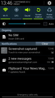
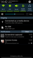
The notification area is probably the greatest beneficiary of the Jelly Bean update. It now offers a brightness control scrubber just below the connectivity toggles. Its top is also occupied by a big digital clock with the date - a minor improvement, but one we really appreciate.
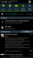
But there is even more to show off here: individual notifications are now expandable. Let's say you've got an email - the sender and subject will pop up in your notification area. In Jelly Bean, you can expand the entry with a pinch gesture to reveal the first few lines the email itself. You can then collapse them again with the opposite pinch move. Neat, isn't it?
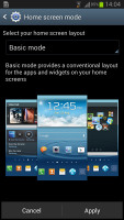
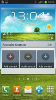
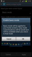
With Jelly Bean Samsung introduces a brand new feature called Home screen mode, which essentially lets you switch between two types of homescreen arrangements - Basic and Easy. Its true purpose is really simple but it can be turned into a far more useful setting.
If you have ever turned on a new Galaxy S III you've already seen Basic mode. This mode is used by default in Samsung droids and gives you the familiar pack of widgets - weather, search, music player and a bunch of shortcuts.
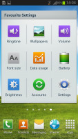
The Easy mode, on the other hand, brings a few new widgets, which feature larger buttons, favorite contacts, favorite apps and a keypad on your home screen. This should allow you to use your Galaxy S III with the things on your home screen with minimal interactions with the app drawer, the notification area and other more "complicated" menus.
The best part of those two modes is that you customize both as you please and your Galaxy S III will save the changes. That way you can easily create two different layouts, e.g. work and fun or travel and home and alternate between them quickly. It can easily be used to mimic what HTC offers with their Scene modes within the Sense UI.
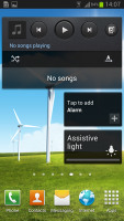
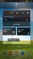
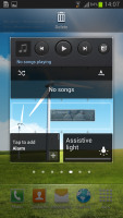
And while we are on the widgets topic, we have to mention their new behavior - they now support automatic resizing and reshuffling. Let's say you are trying to add a new widget on a home screen, but the ones already in place need to be repositioned to make room. With Jelly Bean, they'll do that automatically for you. Also, if the widget you are trying to add is bigger than the available space but supports resize then it will automatically shrink to fit into the free area.
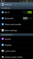
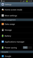
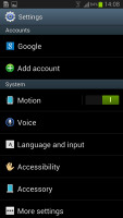
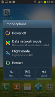
The last thing the Jelly Bean update brings to the UI is the new Settings menu. It's been reorganized to be easier to find what you're looking for, with the less important stuff being put into a 'More Settings' menu for each category. Three sound toggles has been added within the menu trigger by holding the power/lock key.





+ comments + 1 comments
Well, Samsung Galaxy S III is the amazing phone with wide and attractive look and also thousands of applications. While searching I found the Samsung Galaxy S III Skin Cover as it seems to be best way to protect against scratches.
Samsung Galaxy S III Skin Cover
Post a Comment